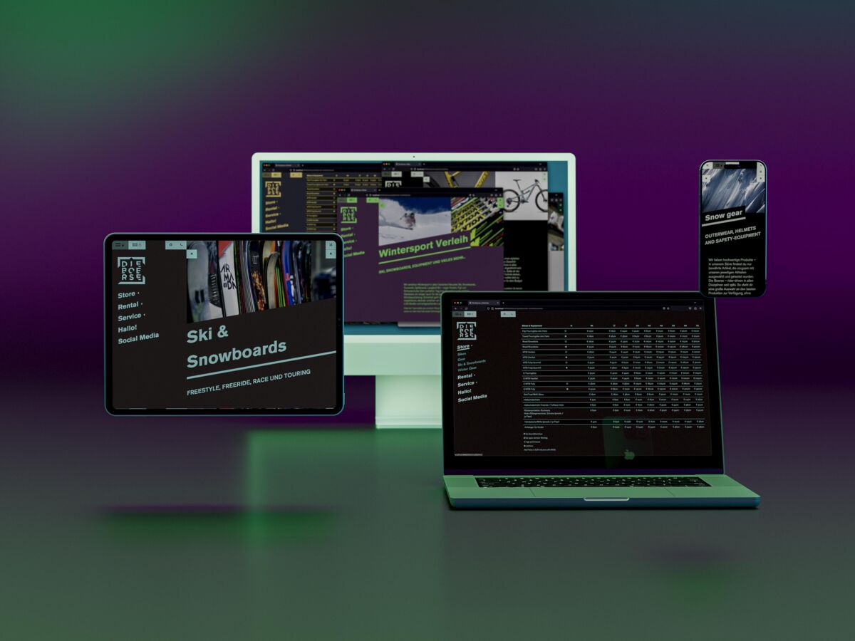
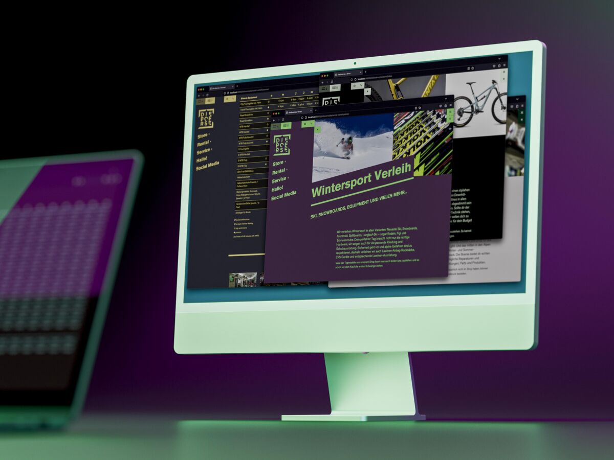
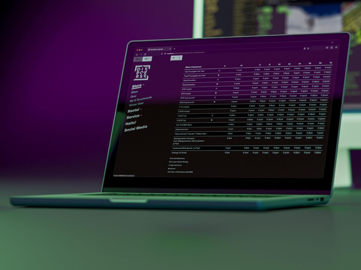
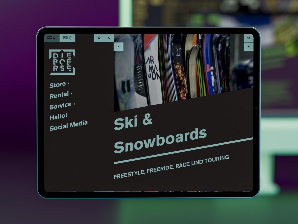
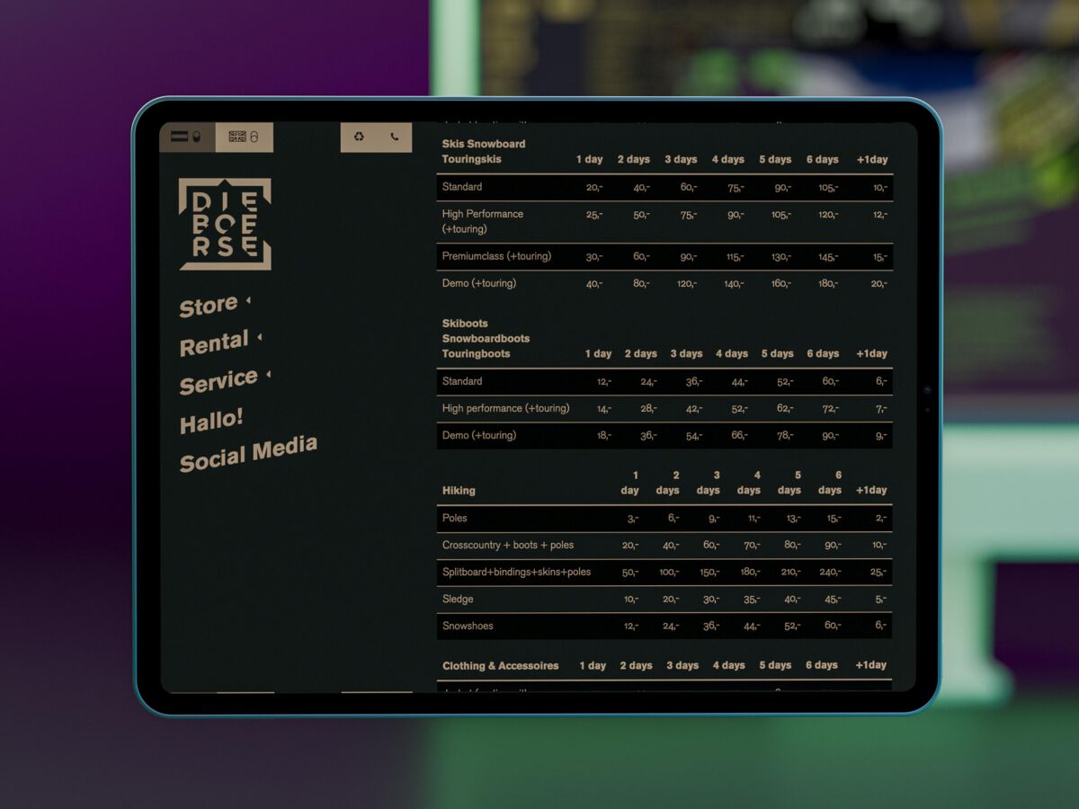
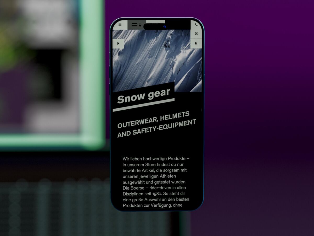
In line with the design guidelines from the logo redesign, we designed a surface that works intuitively and directly, but always remains exciting. Along the high-contrast design of the brand, the website creates a new colour harmony with each visit, which is taken over in all blocks and layouts. By deep implementation in JS and LESS, more complex elements such as forms, tables, logos and icons follow the color harmonies.